Mapping race in the city
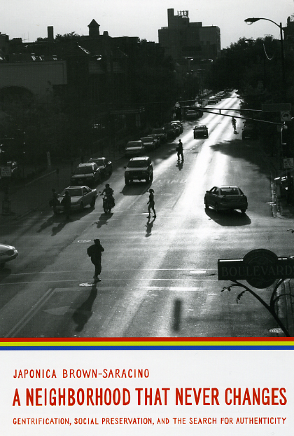 If you want to get our attention here at the Chicago Blog, all you need to do is combine two of our favorite things—maps and urban sociology. Our love for maps is strong, and our interest in the social dynamics of cities, especially those of our hometown, is deep. So it’s no surprise that today’s infographic of the day from Fast Company caught our eye. That post presents Eric Fischer’s finely detailed and rather beautiful maps depicting racial integration (or its lack) in many major American cities. Fischer was inspired by Bill Rankin’s map of Chicago’s racial makeup, which reveals that while the city continues to be highly segregated, some traditional ethnic enclaves are transforming. One such Chicago neighborhood—Andersonville and the area around the Argyle stop on the red line—is analyzed in detail in Japonica Brown-Saracino’s A Neighborhood that Never Changes: Gentrification, Social Preservation, and the Search for Authenticity.
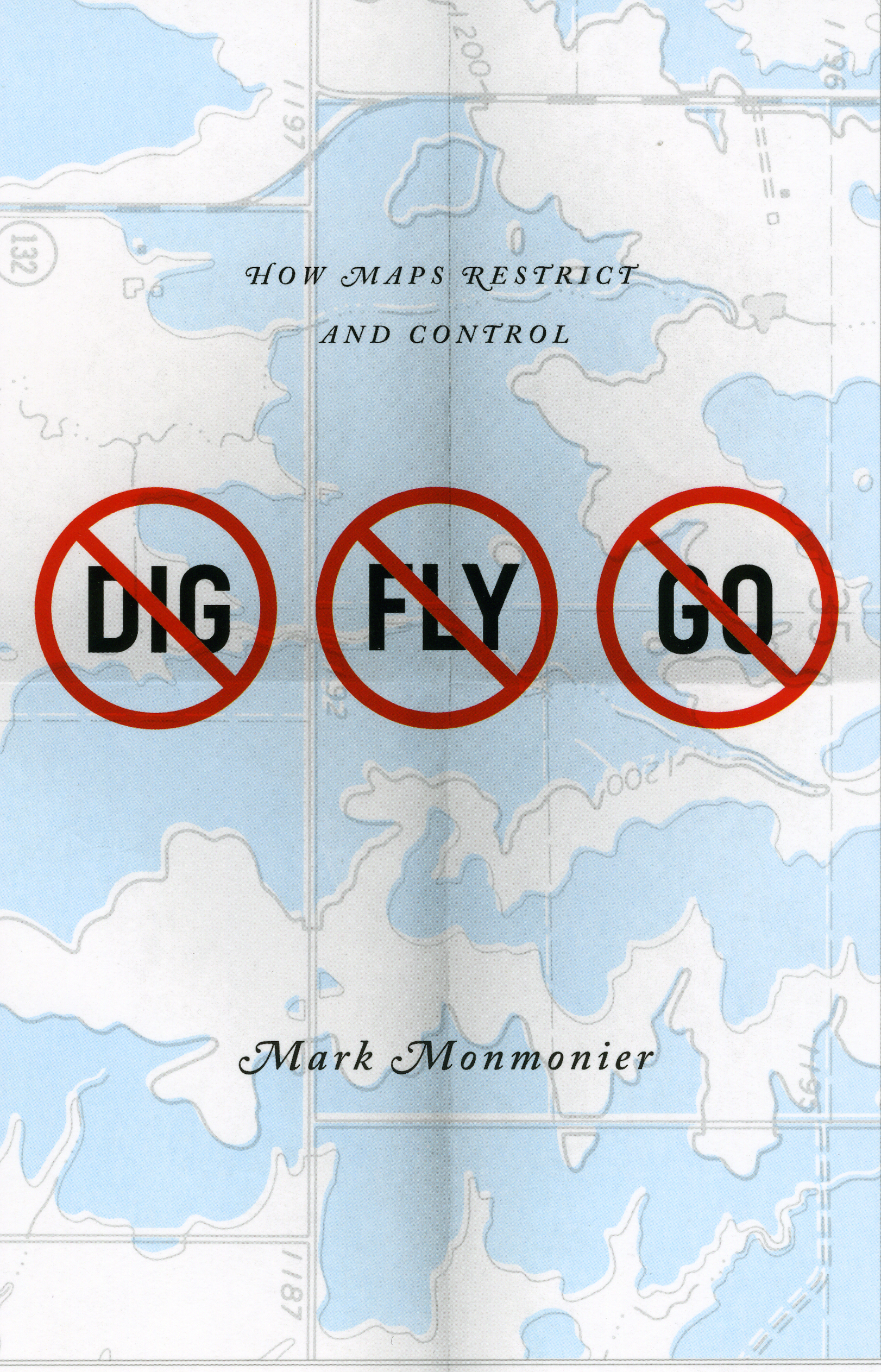 As Rankin notes, his map overturns the usual way of delineating areas of cities, where “neighborhoods are almost always drawn as perfectly bounded areas.” That traditional approach can undermine our understanding of what’s really happening in cities. The power of maps to change our perception of reality has been at the heart of cartographer Mark Monmonier’s work for more than a decade, beginning with How to Lie with Maps and appearing most recently in No Dig, No Fly, No Go: How Maps Restrict and Control. A characteristically brilliant survey of restrictive mapping, Monmonier’s new book takes a hard look at borders, concluding that mapped boundaries, however persuasive their appearance, are not always as permanent and impermeable as their cartographic lines might suggest.