We are here

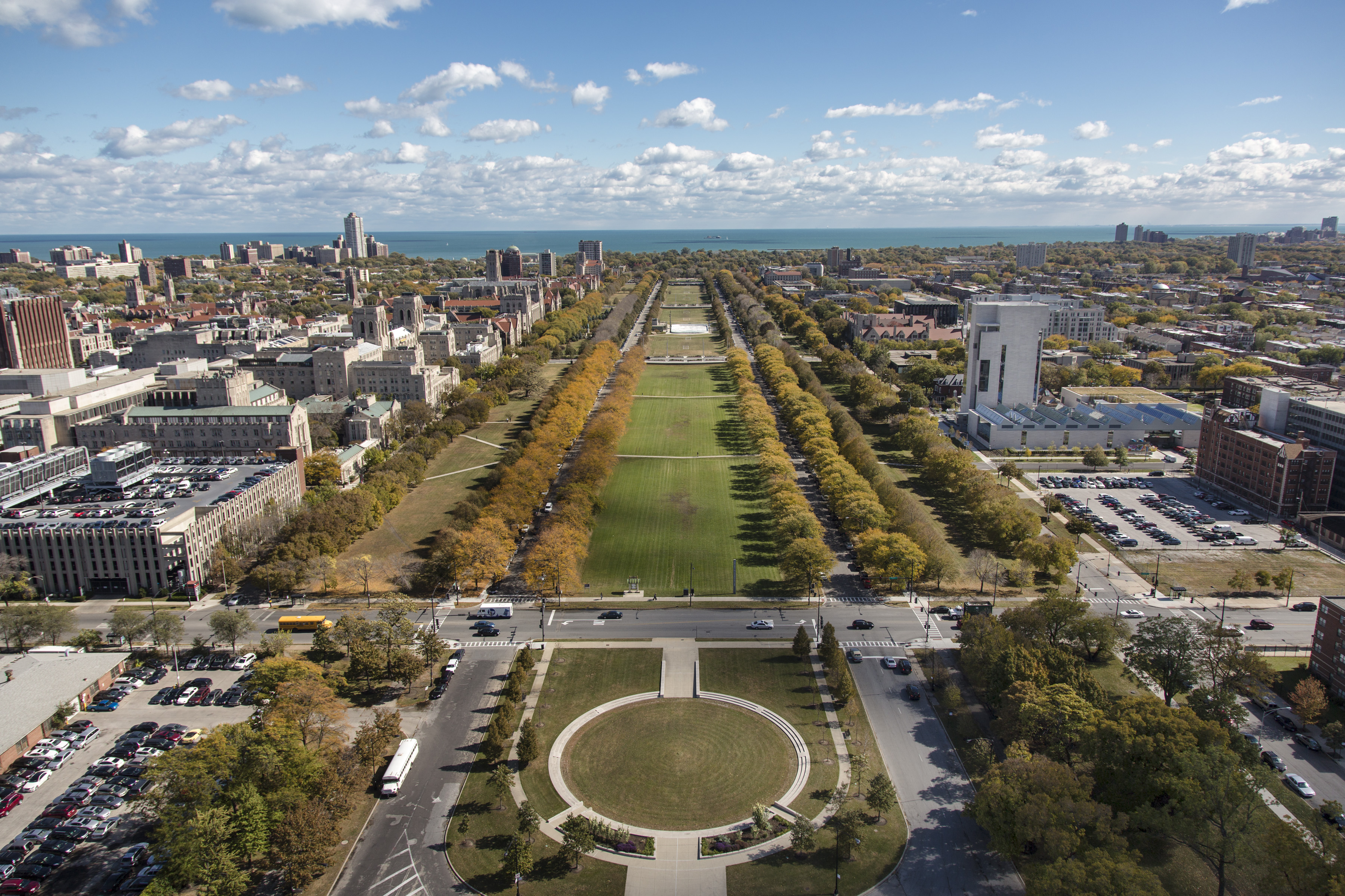
 Ideas don’t exist in a vacuum, and neither does the University of Chicago Press. We share a corner of a immensely beautiful campus where Gothic structures mingle with modernist marvels, and a who’s who of architects give the Loop a run for its money (people aren’t quite lining up to stare down from the top of the Logan Center yet, but just give it time!). Even our heating and chiller plants are stunning, an especially lucky fact since the Press building overlooks the towering South Campus Chiller Plant with its engineering inner workings fully on display.
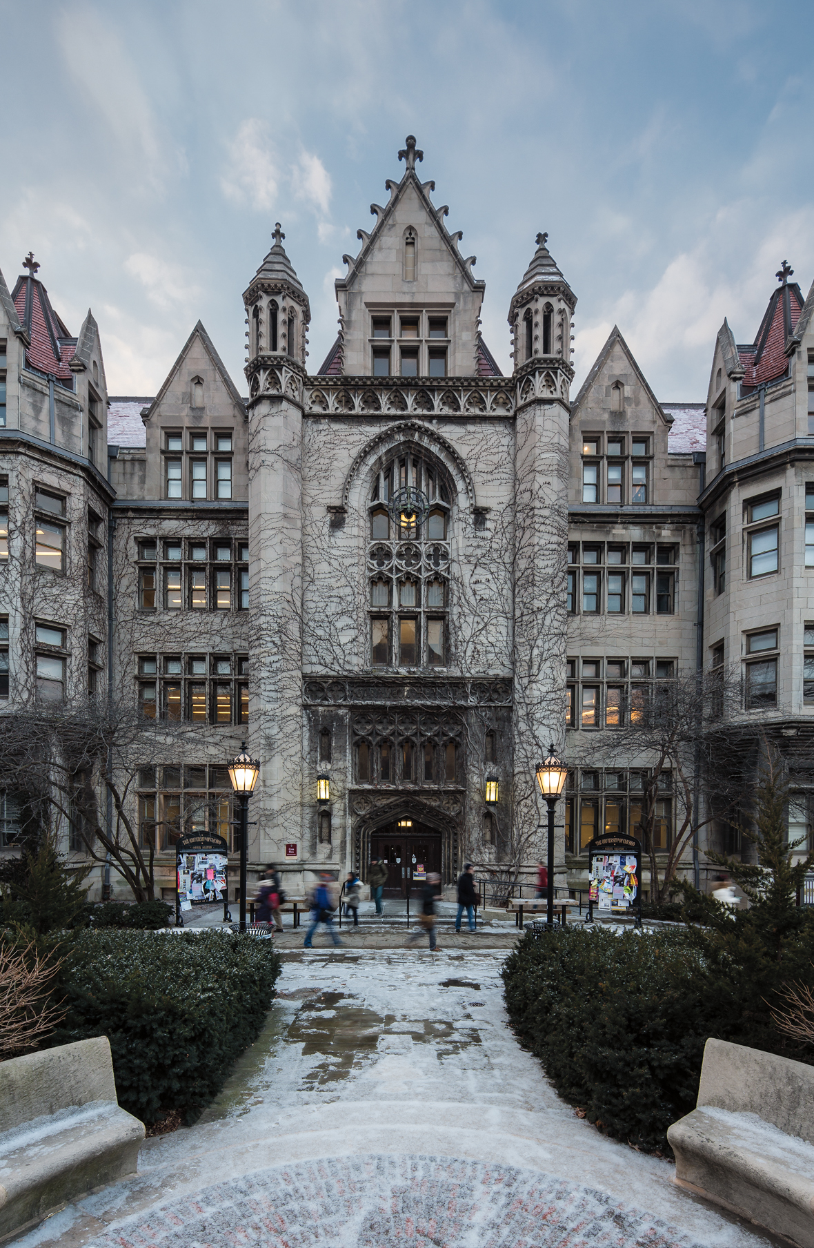
But while they make impressive photo ops and allow for games of spot-the-gargoyle, why the gothic buildings? Why did the forward-thinking university start with an architectural style that was centuries old? The answer lies in the beautifully illustrated new book Building Ideas: An Architectural Guide to the University of Chicago.
***
 For the physical plan and architectural design, the founding trustees considered six local firms. Chicago’s architectural talent was adept at executing large projects, maintaining budgets, and creating designs that consistently impressed (albeit grudgingly) the critics from the East Coast. Chicago School architects designed for a demanding city: for developers who craved square footage, for building occupants who loved abundant natural light and fresh air, and for Chicagoans who aspired to distinctive and occasionally sublime architecture. The trustees appeared determined to create a campus as emblematic of the university mission as the downtown skyscrapers were of the city’s soaring economic ambitions.
The winning proposal was submitted by Henry Ives Cobb, whose portfolio in Chicago included tall office buildings along with well-appointed residences. Cobb’s was not the most beautifully rendered entry, but the relationship he had formed with Hutchinson and Ryerson—Hutchinson was a member of the Chicago Athletic Association, which Cobb had recently designed to significant praise— may have helped him secure the university commission.
Cobb’s original proposal for buildings in the Romanesque style was quickly revised to the Gothic, which lent the campus an air of distinction and erudition—this in a city that had often defended itself against an image as hog butcher. Not long after the first buildings went up, the magazine and arbiter Architectural Record endorsed the university’s campus in conception as well as execution. The Gothic style was “selected as far as possible to remind one of the old English Universities of Cambridge and Oxford; in fact to remove the mind of the student from the busy mercantile conditions of Chicago.”
The choice of Gothic offered other advantages as well. Among them was the timeless quality of the buildings, which “struck Gothic notes of permanence and immortality,” as Harper and his compatriots desired. The style harkened to medieval times, a period romanticized as the antithesis of industrialization, impersonalization, and the oppression of the working classes. That bygone age of chivalry, noted for artisanship and individuality, had inspired writers such as Walter Scott, John Ruskin, and William Morris to revive medieval customs, including architecture. On a practical level, Gothic’s asymmetrical massing enabled numerous building types—libraries, classrooms, and laboratories among them. The style’s endless variations of detail assured that the campus would remain unified even as it grew over time.
—from Building Ideas: An Architectural Guide to the University of Chicago by Jay Pridmore (2013)
To take an at-your-desk tour of the University of Chicago campus, visit http://on.fb.me/18xzkdH.
